
WP OpenPanel – More Space for WordPress Sites
WP OpenPanel is a WordPress plugin that is used to open full screen panels on your sites. You can add and manage unlimited panels with rich contents like text, images and also HTML code like creating posts in WordPress. You can use shortcodes and HTML code to add panel buttons into your posts, widgets and themes.
Demos:
WordPress OpenPanel Plugin Demo
WP OpenPanel’s Main Features:
- Support Responsive Design.
- Unlimited Panels.
- AJAX load.
- Open Panels in Panels.
- Support CSS customization.
- Works in WordPress 4.0 or greater.
Change Logs:
Dec 2015: Update Version 1.1:
- Add Next Panel field to add the next button at the top bar.
Oct 2015: First Release.
Table of Contents:
- Installing WP OpenPanel plugin.
- Adding and Editing Panels.
- Adding Panel Buttons into Posts, Widgets.
- Parameters.
Section 1: Installing WP OpenPanel plugin.
Installing WP OpenPanel plugin is as simple as installing other WordPress plugins:
- First, unzip the file you bought you will get two folders: wp-openpanel-documentation and sonhlab-wp-openpanel-plugin.
- Upload the “sonhlab-wp-openpanel-plugin” folder to your WordPress plugin directory (“/wp-content/plugins”).
- Go to your WordPress Admin Page, then click “Plugins” menu from the left bar. Now you will see “SONHLAB OpenPanel” plugin. Click “Activate” to activate the plugin.
After activating the plugin you will see a new menu (OpenPanel Menu) in the left bar in your WordPress Admin Panel. Now the plugin has been already to use.
Section 2: Adding and Editing Panels.
2.1 Adding Panels:
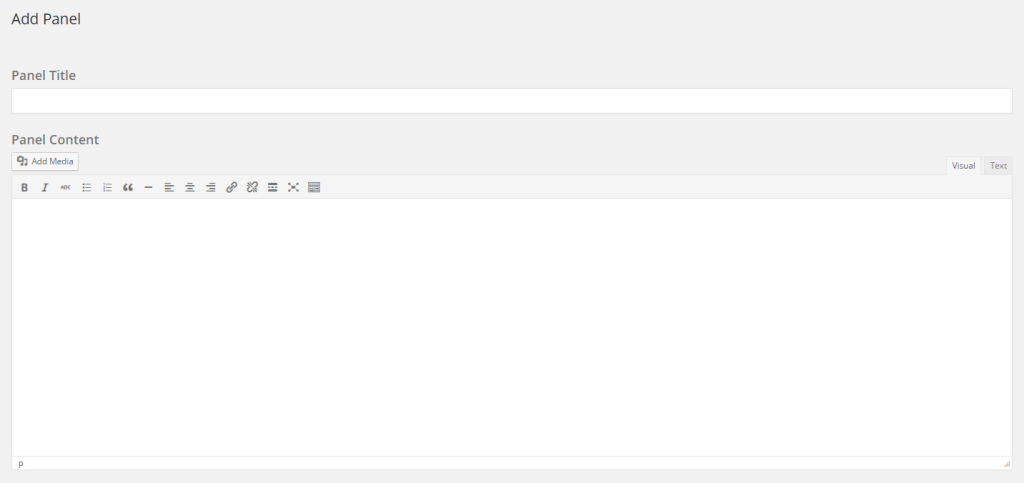
To add a new panel, go to OpenPanel Dashboard from the left side bar, then Click the “Create New Panel” button.
Enter Panel Title and Panel Content just like you create a new post in WordPress. In Panel Content you can also use HTML and CSS to style your content.
You can change the top bar color, the background color and the text color of the panel by changing color code in these fields:

If you have CSS skill you can also add custom CSS for the panel.
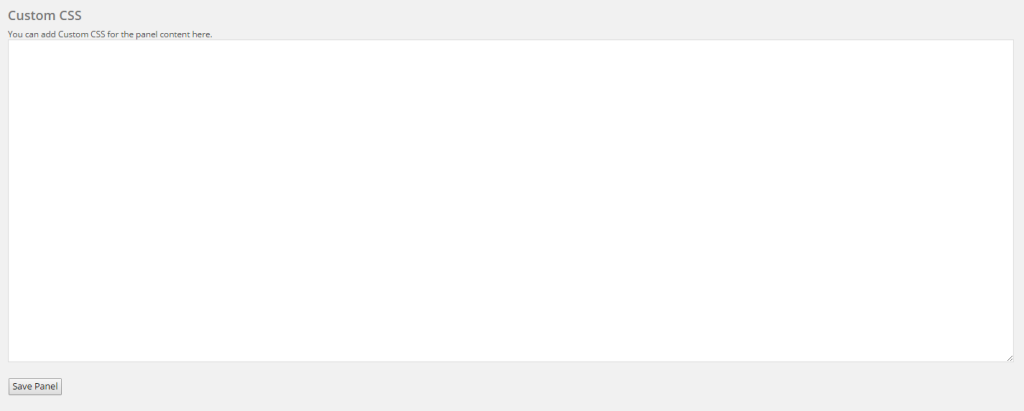
To save the panel, just click on “Save Panel” button.
That’s all. It is simple like creating a new post.
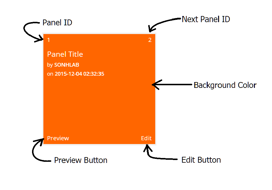
After completing adding the panel you will see a new OpenPanel Card in the OpenPanel Dashboard
2.2 Editing Panels:
To Edit a panel, you click to the “Edit” button in the OpenPanel Card.
2.3 Delete Panels:
To Delete a panel, go to Edit page. At the top right, you will see a “Delete Panel” button. Just click on it to delete the panel.
Section 3: Adding Panel buttons into Posts, Widgets.
There are two ways to add OpenPanel buttons into Posts, Widgets and Themes: Shortcode and HTML code
Shortcode: to add OpenPanel buttons into your Posts/Widgets and also in a Panel, you can use a code like:
[openpanel id="panel-id"]Text/image/HTML code[/openpanel]
You can find “panel-id” in the top left of OpenPanel Card above.
HTML code: If you do not like to use Shortcode or Shortcode does not work in some cases you can use HTML code to show OpenPanel buttons, the code will be simple like this:
<div data-panelid="panel-id" class="op-tab">
  <span>Button Title</span>
</div>
Note: There are two required paarameters always are added in HTML code: data-panelid and “op-tab” class.
Section 4: Parameters.
4.1 Paramaters in Shortcode:
| Parameters | Properties | Description |
| id | Integer. | The id of the panel that you want to display when the button is clicked. |
| type | String. | This param is used to set HTML tag. i.e: div, span, p,… Default: div. |
| effect | String. | This param is used to set showing effect for panels. Values: fade, top, bottom, left, right. Default: fade. |
| auto | Boolean. | This param is used to enable autoshow feature. Only one panel can be displayed automatically. If you enable autoshow for many panel buttons the plugin will set autoshow for the first panel that is enabled. Values: true/false. Default: false. |
| class | String. | This param is used to add CSS classes for panel buttons. |
| style | String. | This param is used to add CSS style for panel buttons. |
Example:
[openpanel id="7" type="span" effect="left" auto="true" class="your-own-class" style="color:#E51400;"]Text button[/openpanel]
The code above will create a button that has “Text button” title. It will show a panel that has ID=7 automatically with “left” effect. Additionally, the button also has “your-own-class” and Text Color is Red (color:##E51400). The button type is span so it can be in a paragraph like normal text.
4.2 Parameters in HTML code:
| Parameters | Properties | Description |
| data-panelid | Integer. | The id of the panel that you want to display when the button is clicked. |
| data-effect | String. | This param is used to set showing effect for panels. Values: fade, top, bottom, left, right. Default: fade. |
| data-auto | Boolean. | This param is used to enable autoshow feature. Only one panel can be displayed automatically. If you enable autoshow for many panel buttons the plugin will set autoshow for the first panel that is enabled. Values: true/false. Default: false. |
Example:
<div data-panelid="9" data-effect="top" data-auto="true" class="op-tab">
  <span>Auto Panel</span>
</div>
The code above will add a button that has “Auto Panel” title. It will show the panel that has ID=9 automatically with “top” effect.
<div data-panelid="12" class="op-tab">
  <span>Simple Button</span>
</div>
The code above will add a button that has “Simple Button” title. When it is clicked a panel that has ID=12 will be displayed with “fade” effect (default effect).
Note: As you see two examples above, there always have “op-tab” class.
That’s it. If you have any questions that beyond the scope of this plugin, please feel free to open new tickets in WP OpenPanel Support Zone. No guarantees, but I’ll do my best to assist you. Thanks so much!