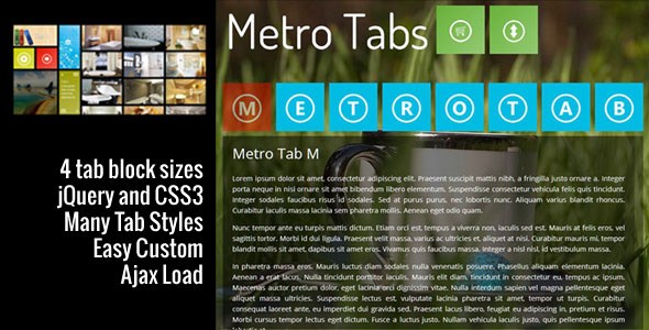
Metro Tabs CSS3 jQuery Plugin Documentation
Metro tab is a light jQuery plugin to create tabs with metro style. You can align tab positions at anywhere you like ( horizontal/vertical or any way ). The content can be anything ( paragraphs, images, videos, iframes, … ). Every content is an independent file. When a metro tab is clicked the content of this tab will be loaded by ajax method with effects. You can customize the style of tabs and content by choose from many styles, many colors/images have already created in CSS file or make new ones on your own.
Note: This version is old, please check new version of this plugin at: http://docs.sonhlab.com/metrotab-responsive-metro-ui-tabs/
Metro Tab Features:
- 4 Metro Tab Block Sizes.
- jQuery, CSS3 Effects.
- Many options to customize the style.
- Fit with both horizontal and vertical layout.
- Support Almost Browsers.
- Ajax Load.
- Inline Content For SEO Purpose.
- Easy Customize Orientations.
Change Logs:
09 Jan 2013: Release version 2.0.
05 Nov 2012: Update version 1.5:
- Support Inline Content For SEO Purpose.
- Fix Bugs.
24 Aug 2012: Update ver 1.4.
- Improve Ajax Load.
- Add new param to change content file extension.
- Add new fade effect.
- Compatibility jQuery 1.8.
NOTE : In this upate I renamed the param ‘slidedirection’ to ‘mtEffect’. So if you are using ‘slidedirection’ please rename it to ‘mtEffect’.
24 Jul 2012:
- Support older jQuery ( 1.4.x+ ).
- Add a new param to set content block.
06 Jul 2012:
- Add a new parameter to change Scroll Bar style.
- Add more transparent background colors.
09 Jun 2012:
- Optimize Javascript code.
05 Jun 2012:
- First Version.
Customer’s Feedback:
THE BEST SLIDING TAB – METRO TABS
modern sliding tab… not the old fashioned sliding tab!
I have finally configured my metro tabs in my site. It is giving me the service that I expected.
The best of the Metro Tabs is : it can be customized the way you want. I think this is the only sliding tab I could customize with my imagination.
The interesting feature is that The buttons can be customized in shape, color, position, effect etc as well as the content portion of the tab could also be customized with background, color, size, position, effect etc. In one word, anybody can create his own custom sliding tab with the great Metro Tabs.
The coding of the tab is professionally done and the author was very much cooperative to assist me during my customization of the tab.
zahid ( single @codecanyon )
Credits:
Metro Tab is developed by SONHLAB.com and used below third parties:
- jQuery Library.
- jQuery Easing Plugin.
- jScrollPane Plugin.
- MouseWheel Plugin.
Table Of Content:
- Setup Metro Tab.
- Metro Tab Structure.
- Create Sample Metro Tab.
- Parameters and Easing List.
[ga_res]
Section 1: Setup Metro Tab.
This section will tell you how to setup metro tabs plugin.
First of all, to ensure everything works correctly, please use <!DOCTYPE html>.
Include the following code into HEAD section of the page.
For Internet Explorer 8 works correctly we need to add:
<!--[if lt IE 9]>
<script type="text/javascript">
var is_ie_lt9 = true;
document.createElement('header');
document.createElement('section');
document.createElement('figure');
document.createElement('figcaption');
</script>
<![endif]-->
Including CSS files:
<link rel="stylesheet" href="css/metrotabs.css" type="text/css" />
<link rel="stylesheet" href="css/jscrollpane/scroller.css" type="text/css" />
Including Javascript file:
<script type="text/javascript" src="js/jquery/jquery.min.172.js"></script>
<script type="text/javascript" src="js/jquery/jquery.easing.13.js"></script>
<script type="text/javascript" src="js/jscrollpane/jquery.mousewheel.min.js"></script>
<script type="text/javascript" src="js/jscrollpane/jquery.jscrollpane.min.js"></script>
<script type="text/javascript" src="js/metrotabs.min.js"></script>
Call metrotabs plugin:
<script type="text/javascript">
$(document).ready(function() {
	$(TheBlockHolderID).metrotabs({
		ContentAreaId: 'mt-content', // Where content will be shown.
		outeffect: 'easeInBack', // see Effect List below.
		ineffect: 'easeOutBack', // see Effect List below.
		moveout: 'BottomOrRight', // TopOrLeft | BottomOrRight.
		movein: 'TopOrLeft', // TopOrLeft | BottomOrRight.
		outduration: 400, // milisecond.
		induration: 400, // milisecond.
		mtEffect: 'horizontal', // vertical | horizontal | fade.
		scrollbarstyle: 'mt-black' // See Background List in metrotabs.css.
	});
});
</script>
Setup done.
Section 2: Metro Tab Structure.
Standard style structure:
<div id=”content-file-name“ class=” Size-class Background-class Hovereffect-class Loadcontent-class “>
	<div class=”scene-1 scene-size scene-decoration”>…</div>
	<div class=”scene-2 scene-size scene-decoration”>…</div>
</div>
Caption block structure:
<div id=”content-file-name“ class=”Size-class Background-class Hovereffect-class Loadcontent-class“>
<figure class="cap-bot">
		<div class=” scene-label scene-height scene-decoration”>…</div>
	<figcaption>…</figcaption>
</figure>
</div>
Section 3: Create Sample Metro Tab.
This section should be read along with the “metrotabs.html” file also contained in the download package.
First, we need to create a block holder to contain blocks.
<div id="metrotabs-blocksholder">
	<!-- Add blocks here -->
</div>
Second, now we can add a block into block holder. To the block can load a new content we add an id into the block ( the code below will load tab1.php when block 1 is clicked, and tab2.php when block 2 is clicked ):
<div id="metrotabs-blocksholder">
 <!-- Block 1 -->
 <div id="tab1" class="mt-block1 mt-red mt-changescene mt-loadcontent">
  <div class="mt-scene-1 mt-b1 mt-gradient">
   <div class="mt-scene-label mt-height1"><img src="content/img-demo/mes.png" alt="" /></div>
  </div>
  <div class="mt-scene-2 mt-b1">
   <div class="mt-scene-label mt-height1"><img src="content/img-demo/people.png" alt="" /></div>
  </div>
 </div>

 <!-- Block 2 -->
 <div id="tab2" class="mt-block1 mt-grass mt-blockcaption mt-imagerotationeffect mt-loadcontent">
  <figure class="cap-bot">
   <div class="mt-scene-label mt-height1 mt-gradient"><img src="content/img-demo/setting.png" alt="" /></div>
   <figcaption>Tab 2</figcaption>
  </figure>
 </div>
</div>
*** mt-height1, mt-height2 class: If the image height is same the block height you do not need to use them but if the image height is smaller than the block height and you want to align the image in middle you need to use them.
To load a default content we just add the mt-active class. Example: If you want the content in tab1.php will be shown in content zone when somebody open your page.
<!-- Block 1 -->
<div id="tab1" class="mt-block1 mt-red mt-changescene mt-loadcontent mt-active">
 <div class="mt-scene-1 mt-b1 mt-gradient">
  <div class="mt-scene-label mt-height1"><img src="content/img-demo/mes.png" alt="" /></div>
 </div>
 <div class="mt-scene-2 mt-b1">
  <div class="mt-scene-label mt-height1"><img src="content/img-demo/people.png" alt="" /></div>
 </div>
</div>
To align a block to left we will put the block code into a <div class=”mt-left”></div>
<div id="metrotabs-blocksholder">
 <!-- Block 1 -->
 <div class="mt-left">
  <div id="tab1" class="mt-block1 mt-red mt-changescene mt-loadcontent">
   <div class="mt-scene-1 mt-b1 mt-gradient">
    <div class="mt-scene-label mt-height1"><img src="content/img-demo/mes.png" alt="" /></div>
   </div>
   <div class="mt-scene-2 mt-b1">
    <div class="mt-scene-label mt-height1"><img src="content/img-demo/people.png" alt="" /></div>
   </div>
  </div>
 </div>

 <!-- Block 2 -->
 <div class="mt-left">
  <div id="tab2" class="mt-block1 mt-grass mt-blockcaption mt-imagerotationeffect mt-loadcontent">
   <figure class="cap-bot">
    <div class="mt-scene-label mt-height1 mt-gradient"><img src="content/img-demo/setting.png" alt="" /></div>
    <figcaption>Tab 2</figcaption>
   </figure>
  </div>
 </div>
</div>
To separate two blocks we put a <div class="hs1"></div> or <div></div> between two blocks
<div id="metrotabs-blocksholder">
 <!-- Block 1 -->
 <div class="mt-left">
  <div id="tab1" class="mt-block1 mt-red mt-changescene mt-loadcontent">
   <div class="mt-scene-1 mt-b1 mt-gradient">
    <div class="mt-scene-label mt-height1"><img src="content/img-demo/mes.png" alt="" /></div>
   </div>
   <div class="mt-scene-2 mt-b1">
    <div class="mt-scene-label mt-height1"><img src="content/img-demo/people.png" alt="" /></div>
   </div>
  </div>
 </div>

 <div class="hs1"></div>

 <!-- Block 2 -->
 <div class="mt-left">
  <div id="tab2" class="mt-block1 mt-grass mt-blockcaption mt-imagerotationeffect mt-loadcontent">
   <figure class="cap-bot">
    <div class="mt-scene-label mt-height1 mt-gradient"><img src="content/img-demo/setting.png" alt="" /></div>
    <figcaption>Tab 2</figcaption>
   </figure>
  </div>
 </div>
</div>
Final, we need to create a content zone to show the loaded content. Simple create a new block with id=”ContentAreaId” ( In this case is id=”mt-content” ).
<div id=" mt-content"></div>
Section 4: Parameters and Easing List.
Parameters:
| Parameters | Properties | Description |
| ContentAreaId | string | Where the content will be shown. |
| mtFileExtension | string | This param use to set content file extension. |
| outeffect | string | slide effect when the content move out ( see easing list below ). |
| ineffect | string | slide effect when the content move in ( see easing list below ). |
| moveout | string | this parameter will determine the content will move out to left or right ( slidedirection: horizontal ), up or down (slidedirection: vertical ). |
| movein | string | this parameter will determin the content will move in from left or right (slidedirection: horizontal ), up or down (slidedirection: vertical ). |
| outduration | integer | duration in milisecond of outeffect. |
| induration | integer | duration in milisecond of ineffect. |
| mtEffect | string | this parameter will determine the content will slide vertical or horizontal or fade effect. |
| scrollbarstyle | string | This will make style for scroll bar. Use background list. |
Easing List:
swing | easeInQuad | easeOutQuad | easeInOutQuad | easeInCubic | easeOutCubic | easeInOutCubic | easeInQuart | easeOutQuart | easeInOutQuart | easeInQuint | easeOutQuint | easeInOutQuint | easeInSine | easeOutSine | easeInOutSine | easeInExpo | easeOutExpo | easeInOutExpo | easeInCirc | easeOutCirc | easeInOutCirc | easeInElastic | easeOutElastic | easeInOutElastic | easeInBack | easeOutBack | easeInOutBack | easeInBounce | easeOutBounce | easeInOutBounce.
[endedwords product=””]http://talk.sonhlab.com/room/metrotab-jquery-plugin[/endedwords]