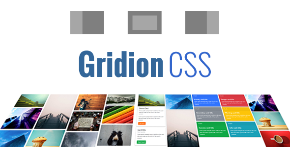
Gridion – Responsive Bootstrap Portfolio Grid CSS
Gridion CSS is a responsive grid layout that is based on famous Bootstrap framework. This simple plugin is used to create portfolios, image galleries with smooth lightboxes to show various contents from images to mix HTML contents. It is also included a lots of CSS animation effects to show/hide contents.
Demos:
- Column Styles:
- Card Styles:
Gridion CSS Features:
- Based on Responsive Bootstrap framework v4.
- Supports normal column and modern card styles.
- 4 styles of Lightbox/Panel.
- Supports various contents with CSS animation effects.
- Simple HTML Structure.
Change Logs:
Nov 2018: Ver 1.1
- Improved Card style to display better.
Dec 2017: First Version.
Credits:
Table of Contents:
- Installing Gridion CSS plugin.
- Gridion HTML Structure.
- CSS3 Animations and Lightbox Style Classes.
Section 1: Installing Gridion CSS Plugin.
First of all, to ensure everything works correctly, please use <!DOCTYPE html>.
Include the following code into HEAD section of the page.
Include CSS files:
<meta name="viewport" content="width=device-width, initial-scale=1, shrink-to-fit=no">

<!-- Bootstrap CSS -->
<link rel="stylesheet" href="css/bootstrap/bootstrap.min.css" type="text/css" />

<!-- CSS3 Animation -->
<link rel="stylesheet" href="css/animate.css" type="text/css" />

<!-- Linear Icons (Option) -->
<link rel="stylesheet" href="css/linearicons.css" type="text/css" />

<!-- Sonhlab Styles (Option) -->
<link rel="stylesheet" href="css/sonhlab-base.css" type="text/css" />

<!-- Gridion CSS Pack -->
<link rel="stylesheet" href="css/gridion.css" type="text/css" />
If you are using Bootstrap version 3.x then you need to include one more CSS file for compatibility:
<!-- Bootstrap v3 fix -->
<link rel="stylesheet" href="css/gridion-bootstrap-v3-fix.css" type="text/css" />
When working with the Bootstrap version 3.x the design may be slightly different but the features will work well. For the best experience, you should use the version 4.x of Bootstrap framework.
Installation is done and the plugin has already been to use.
Section 2: Gridion HTML Structure.
This section should be read along with the example files are also included in the download package.
A simple Gridion CSS Structure has two main parts: Gridion Item Holder and Gridion Content Holder:
<!-- START GRIDION -->
<ul class="gridion">

  <!-- Start Gridion Item Holder -->
  <div class="gridion-item-holder">

    <!-- Start an Item -->
    <div class="gridion-item">
      <label for="lightbox-id" class="gridion-item-frame">
        ...
      </label>
    </div>
    <!-- End an Item -->

  </div>
  <!-- End Gridion Item Holder -->

  <!-- Start Gridion Content Holder -->
  <div class="gridion-content-holder">

    <!-- Start a lightbox -->
    <input type="checkbox" name="gridion-switch" id="lightbox-id" class="gridion-none">
    <div class="gridion-content">
      ...
    </div>
    <!-- End a lightbox -->

  </div>
  <!-- End Gridion Content Holder -->

</ul>
<!-- END GRIDION -->
Gridion Item Holder is the place that contains all items in the grid.
Gridion Content Holder is the place that contains contents that will be displayed when grid items are clicked. If you don’t need to show content lightboxes you can remove this part freely.
If you want to make a clickable item to show lightbox, you need to add a hidden checkbox to control the lightbox content. When a label with [for=”content-id”] is clicked the hidden checkbox [id=”content-id”] will be checked then a lightbox that is controlled by the checkbox will be displayed.
To create hidden checkboxes you just create normal checkboxes then adding name="gridion-switch" and class="gridion-none" into the checkboxes.
To make a lightbox automatically displays you just add “checked” into the hidden checkbox of the lightbox.
Section 3: CSS3 Animations and Lightbox Style Classes.
Lightbox Style Classes:
The plugin has 4 styles of lightbox, including 3 styles for mix contents and 1 for the only one image.
When you want to show mix contents you can use one of these classes:
gridion-content-style-center
gridion-content-style-left
gridion-content-style-right
When you want to show only one image/photo you should use this class for the best perfomance:
gridion-content-style-photo
Showing Animation Effects:
These classes can be used with the lightbox style classes above to play animation effects
gridion-effect-fade
gridion-effect-bounce
gridion-effect-bounceIn
gridion-effect-bounceLeft
gridion-effect-bounceRight
gridion-effect-bounceUp
gridion-effect-bounceDown
gridion-effect-pulse
gridion-effect-flash
gridion-effect-rubberBand
gridion-effect-shake
gridion-effect-swing
gridion-effect-tada
gridion-effect-wobble
gridion-effect-jello
gridion-effect-lightSpeed
gridion-effect-rotate
gridion-effect-rotateUpLeft
gridion-effect-rotateDownLeft
gridion-effect-rotateUpRight
gridion-effect-rotateDownRight
gridion-effect-rollIn
gridion-effect-slideUp
gridion-effect-slideDown
gridion-effect-slideLeft
gridion-effect-slideRight
gridion-effect-jackBox
gridion-effect-zoom
gridion-effect-zoomLeft
gridion-effect-zoomRight
gridion-effect-zoomUp
gridion-effect-zoomDown
Hiding Animation Effeccts:
These classes can be used with the lightbox style classes above to play animation effects
fadeOut
fadeOutDown
fadeOutDownBig
fadeOutLeft
fadeOutLeftBig
fadeOutRight
fadeOutRightBig
fadeOutUp
fadeOutUpBig
bounceOut
bounceOutDown
bounceOutLeft
bounceOutRight
bounceOutUp
lightSpeedOut
rotateOut
rotateOutDownLeft
rotateOutDownRight
rotateOutUpLeft
rotateOutUpRight
rollOut
slideOutUp
slideOutDown
slideOutLeft
slideOutRight
zoomOut
zoomOutLeft
zoomOutRight
zoomOutUp
zoomOutDown
hinge
[endedwords product=””]http://talk.sonhlab.com/room/gridion-css-plugin[/endedwords]
Same plugin that you may be interested in: